Art Direction & Content Strategy
Wacom specializes in developing graphics or drawing tablets, and related products. I provided the creative direction for their digital merchandising on Amazon platform.

Digital Merchandising Objective
Wacom needed to update their brand presence on the platform, in order to present as the industry leaders.
CREATIVE STRATEGY
• Better convey brand personality, represented authentically to the creative world.
• Connect products with specific audience groups.
• Product content strategy was integral to drive conversions
• Photography Direction: developed story boards for shots needed to capture the product and message

Digital Shelf Elements

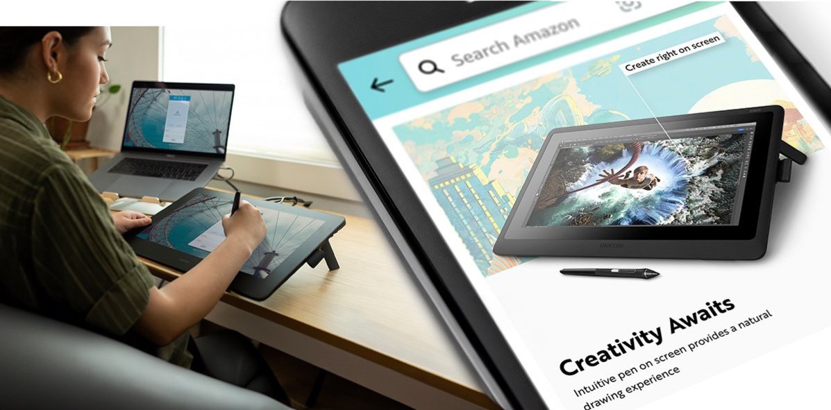
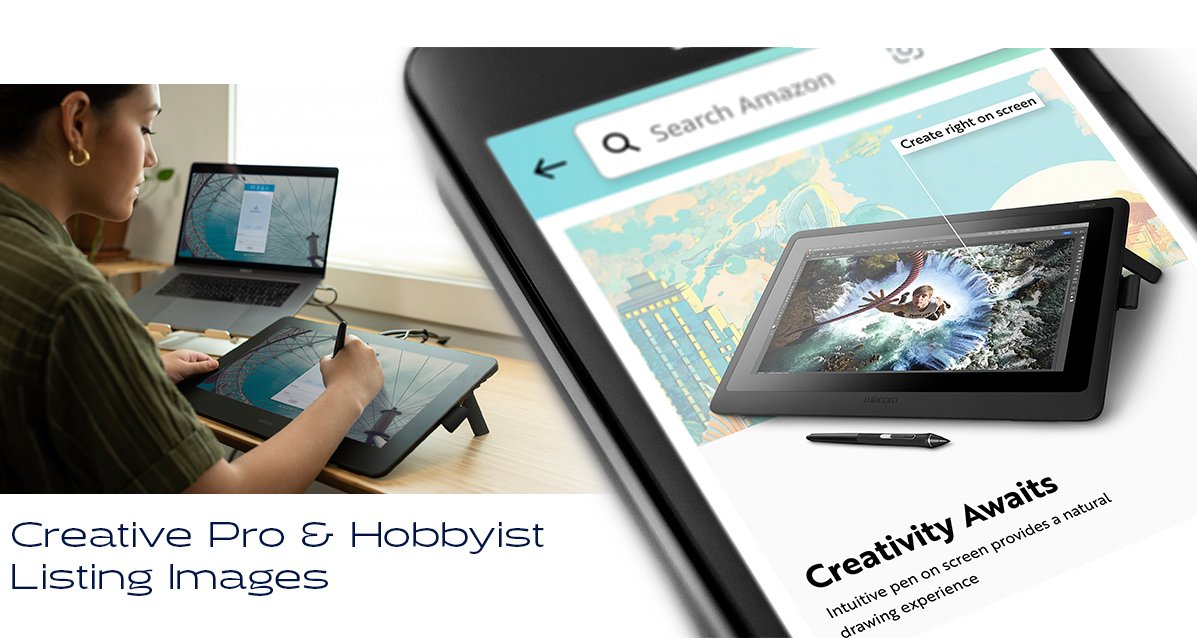
Listing Images
A product page commonly includes 6 images. Pitching a product within 6 images proves to be a challenging creative problem to solve.

Secondary Content
The other piece to a product listing is the enhanced brand content that follows lower on the page.
These layouts are built using platform determined layout blocks. The puzzle with these layouts are finding the best platform blocks to tell the correct story.

Platform Limitations
Digital merchandising assets on the Amazon platform has limitations that are not present in DTC websites.
• Format and limits the quantity of digital images.
• Type needs to work for desktop and mobile.
• The secondary content layouts use platform interface blocks that build the layouts, and limits content.

Education Listing Image Design System
This design worked across their entry level tablet and display pads.

The design system was developed to work across the series, with minor adaptations in content and specs for each model. The full project included about 2 dozen models of drawing tablets or display pads.

To connect with the school age user, the key art visualized drawing coming out of the tablet, as doodles on a school desk. The product messaging positioned to focus on new users, focusing on students and teachers.


Artist User Listing Image Design System
The design style for the creative user was representative of a higher level art capabilities. The content messaging was instead of how to use, conveyed more features, specs and software compatibility.

With knock offs and competitors eating up market share, conveying the quality and reestablishing as an industry leader was key to demonstrate their perceived value.


The user message was expanded on, relaying more details on use case and functionality. The graphics style continued for each target user.

Use Case Graphics
Developed this graphic as a way to visualize the different types of work that can be done using the tool. This was adaptable for each of the target audience focus uses.

Creative Pro Secondary Content
With this audience, additional technical aspects were needed to be conveyed; differences between tablet and display, and the specs between regular vs pro models. I love when I get to develop layouts directly withinmy own demographic.


We continued the direction / graphic system through their accessories which included smart pens, display stands, working hardware and other accessories.


Results
While its hard to isolate the sole contributions of creative efforts when there are advertising used to attract impressions, the conversion rates for the client proved very effective during their key marketing time, back to school.
The client thought the visuals conveyed their use so well, they used them throughout their advertising and marketing for their off platform seasonal campaign.
