Consumer Journey Marketing
Email and social platforms need to convey messages quickly and easily. These projects address the responsive platforms with mobile-first design thats intuitive, informative and visually appeal to convert leads and deliver the consumer through the marketing funnel.

Email Post Purchase Series

Considerations
The design needed to echo the brand design style, and visually present as a series. The brand images use a mix of epic landscapes, architectural images and nature elements.

Learnings
After running the first post purchase emails, they didn’t view well within the mobile delivery. As a majority of the emails were viewed on mobile, the design needed to work within this platform better.
Second item was the content was too much. They were delivering too much content, and important points weren’t coming through.
After reviewing the content including in the email above, there were multiple messages. This content was decided it can work across 3 emails for succinct content delivery.

Art Direction
In addition to developing the design to fit within brand aesthetic, I worked through copywriting ideas. In an effort to go beyond the basic purpose wording, I played with words to identify with their demographic.

Experience & Information
This email is the first in the series. First content needed with the product is basic use. Information graphics and succinct steps conveyed the content in a clear and minimal form.

Information Clarity
After distilling the content into the new format, it was clear there were multiple messages. From here, we separated this email into 2 emails with specific content.

Series Consistency
Emails 2 and 3 utilized series headers, with body content icons leveraged for quick recognition.


Social Media Template Design
A product company wanted a new look for their winter campaign- one social story for each product, 4 stories total. The new style needed to fit within and expand upon the brand aesthetics, with provided copy and line art.

Product specific target audience
Each product has a different audience, and the graphics needed to speak to the audience through photography, and tonality bridging the product and photography.

Consistent layouts
I developed a layout that would be the same between all 4 stories. The background, photo collage and filters, and type color were adjusted to fit the individual product and market appeal.


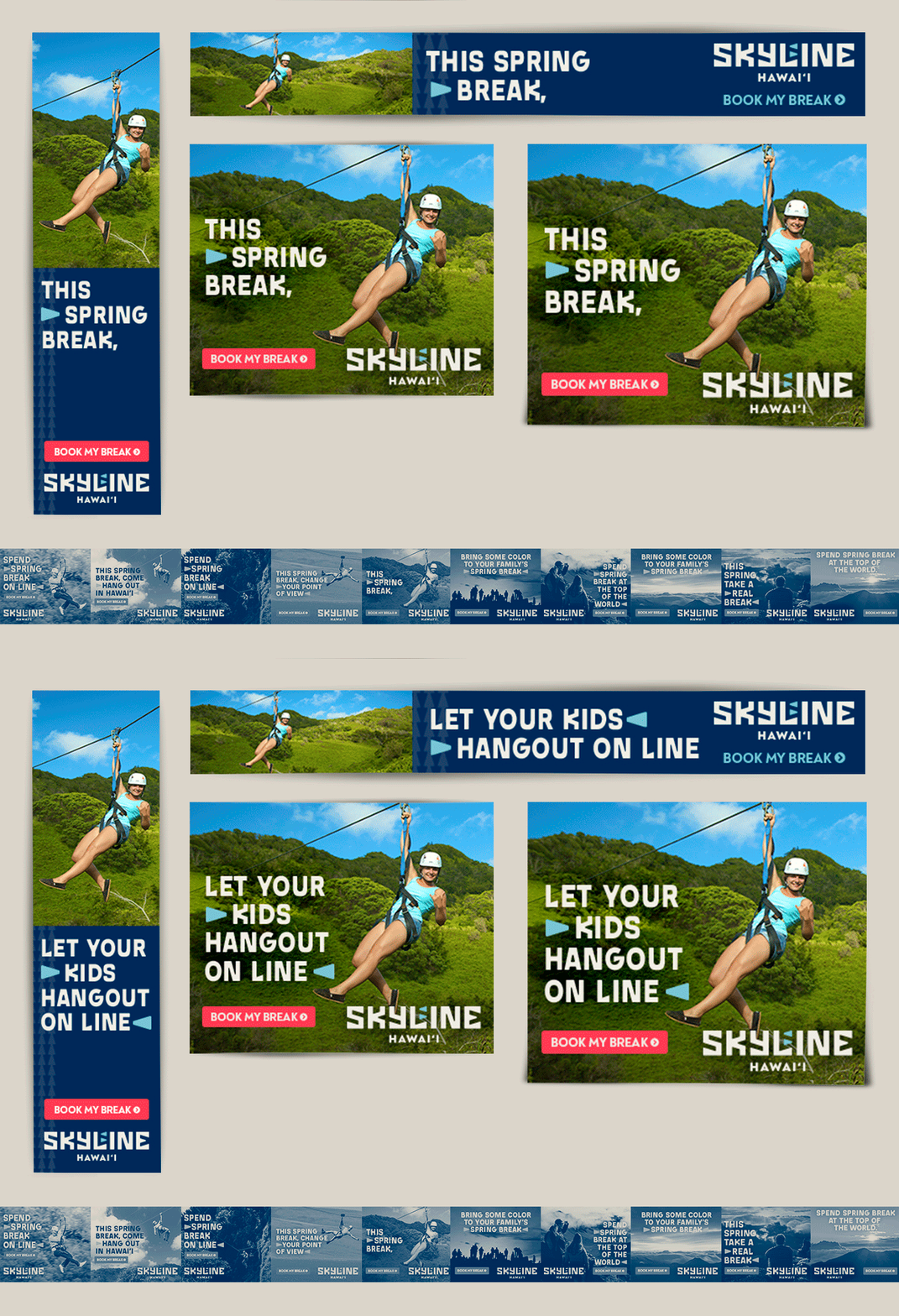
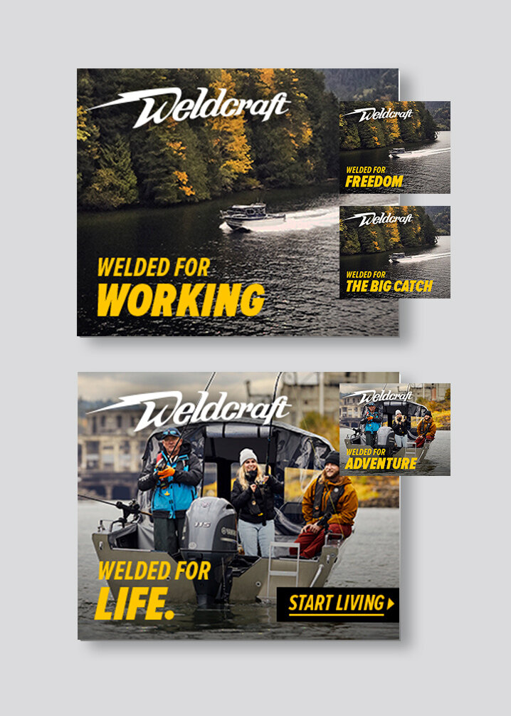
The following campaigns were designed to continue the brand campaign into display ads. They were the first vision of the new brand look or campaign direction.


Digital Ad Campaigns
Featuring html5 animations
Design and development of the client’s new brand campaign, I adapted the guidelines into digital ads. To yield the best traffic, the ads were developed to feature animation- yet with real work budgets in mind, animations were minimal.


Implementation
I adapted the design to fit across highest placement sizes.


