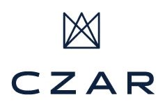
Launching New CZAR Branding
I've had my logo since college, and to date myself thats about a decade ago. Styles and people change dramatically in ten years. In working through putting together my mini portfolio, I was finally able to pull my thoughts together and narrow down a style I wanted.
I wanted to keep a crown, as that works really well for Czar. The type needed updating, as did the color scheme. The mini portfolio Im putting together has a vintage library/geometric theme. In simplifying the elements to the crown, and puling through the geometric look, a new version came together, and I really like it.
The type has a more current look, and the colors are more sophisticated. A friend said it looked like it grew up. I'm excited to implement this to all my new pieces.
Feel free to wander around the site to see the new updates. New colors, new fonts, subtle but details that take website presentation up a notch.
I also spent my weekend updating my resume. This piece will be used on my website, and an abridged version in my mini portfolio. The large directive was to follow the design currently developing for my mini portfolio. With these elements, you can see some of the look Im developing.
