Vintage Designs for Sesame Street
LICENSED ART + CREATIVE INTERPRETATION
This project came to me in need of unique creative development. The client was Virtual Running Company and was granted use of Sesame Street characters to celebrate their 50th Anniversary. The client wanted each shirt to a unique design, as opposed to a variation of the same.
“Distinctly unique design as a collection, not as a series”
While I was granted access to Sesame Street immense library of art, the clients demographic appeal was toward its graphic of Gen Y & Z who grew up watching the show, and would like more to see an abstract representation of the character, as opposed to blatant placed character you would see on children’s clothes. The series included 6 races with 5 characters:
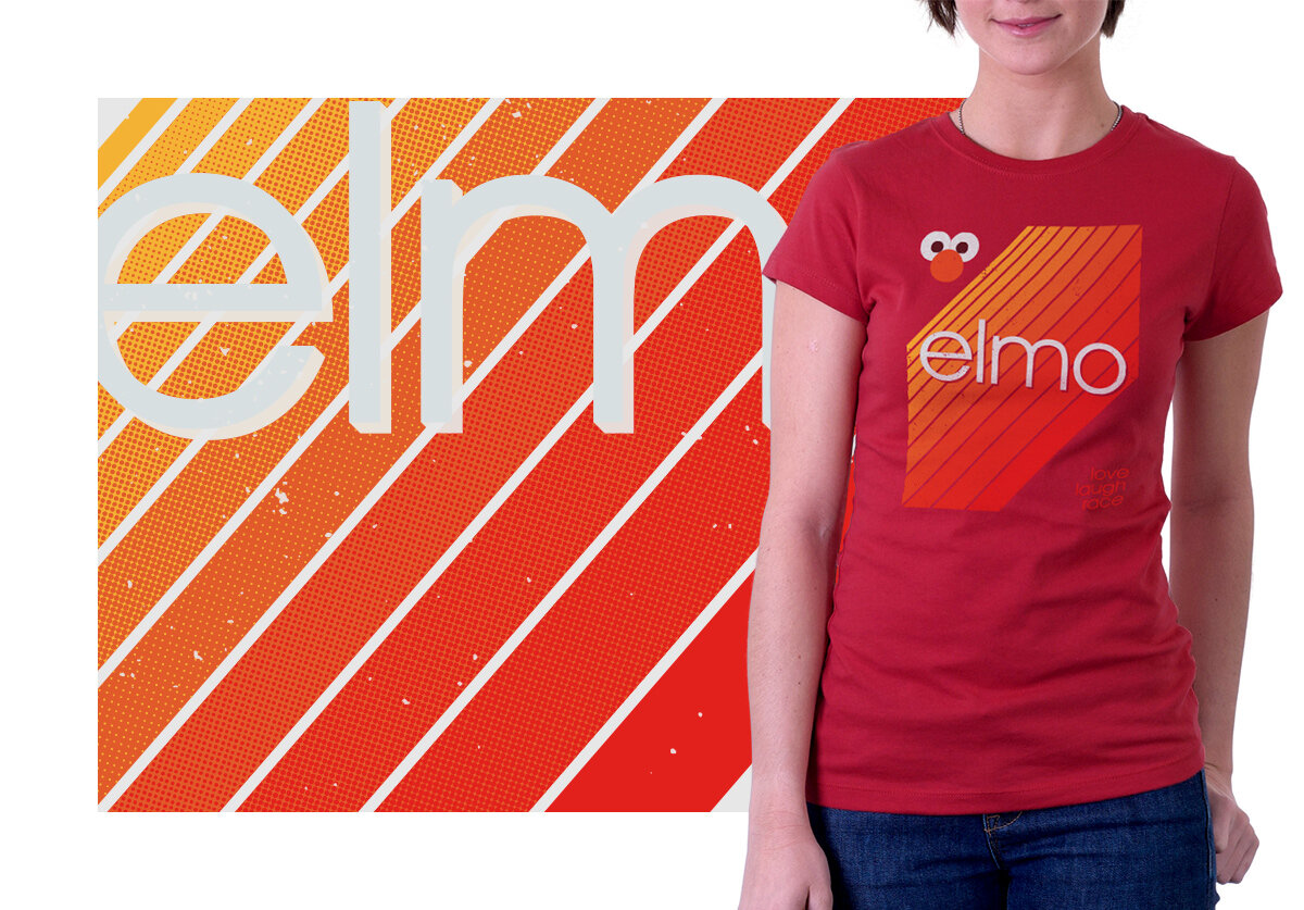
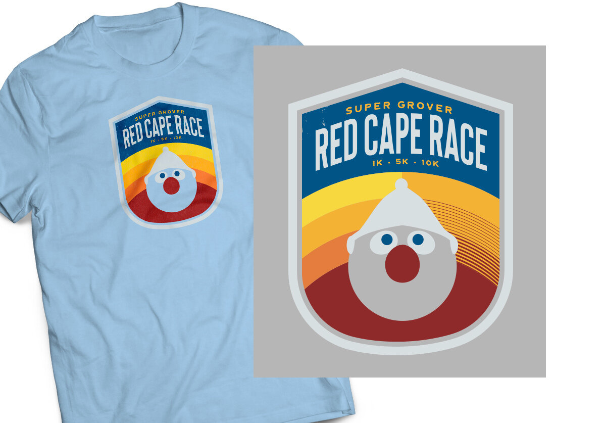
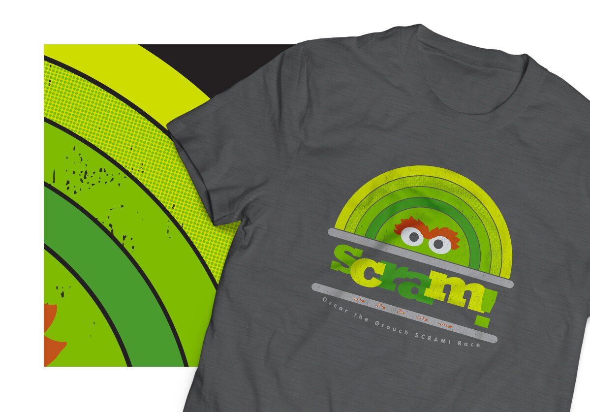
Big Bird, Cookie Monster, Elmo, Super Grover, Oscar, All Characters Anniversary
CREATIVE COMPS
These are deep cutting floor remnants, Not all these made it in front of the client. But some were so cool, they needed to see the light of day- Like Disco Grover!! One thing I loved about working within a classic design aesthetic, is there are a handful of type faces that really ring for classic look. The client at first wanted to use Bert & Ernie, but I dissuaded them mostly due to color limitations but also because Super Grover was my favorite character as a kid.
Click to view larger
This was a rush project as they were already out one creative round, and Sesame Street (SST) had a long approval review process. I produced the first round creative, 6 different t shirt designs within one week. There were probably 2 rounds of edits for each shirt, some with more after hearing back from SSt (Big Bird, Grover and Cookie Monster had 2 creative rounds, but I really think it made the whole set better).
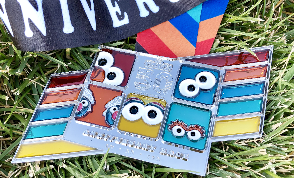
Along with t-shirt artwork, the design had to translate into a medal. Full disclosure- I didn’t give any thought to the medal design except removing the distressing. Next time I know to include a more detailed directive for the medal designs.
FIRST ROLL OUT
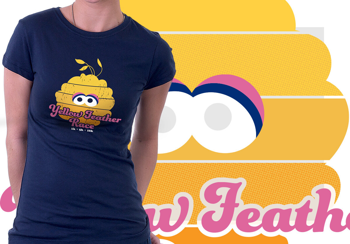
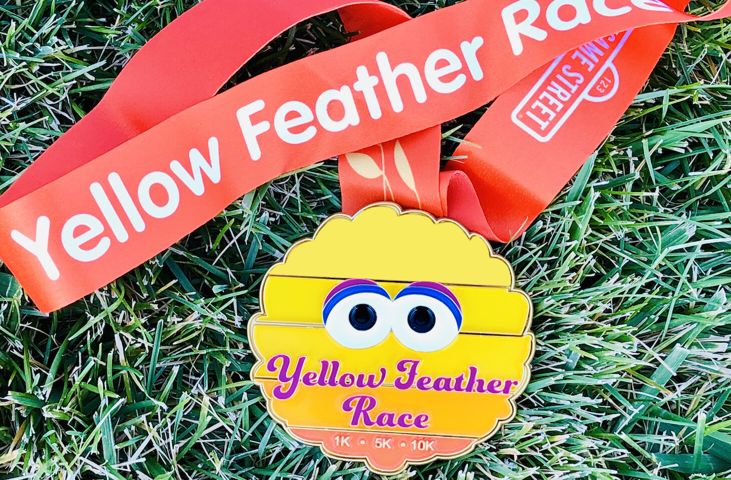
A major consideration with artwork that will be silkscreened is designing to suit the production method, ie gradients become halftones. Another aspect is color use. This Big Bird design is different than the standard Big Bird (eye coloring) to suit the color use for the whole design.
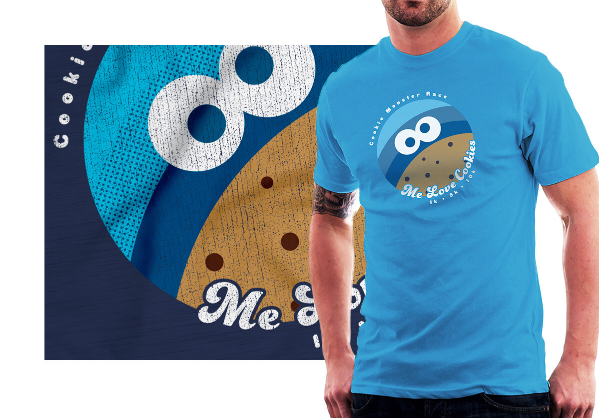
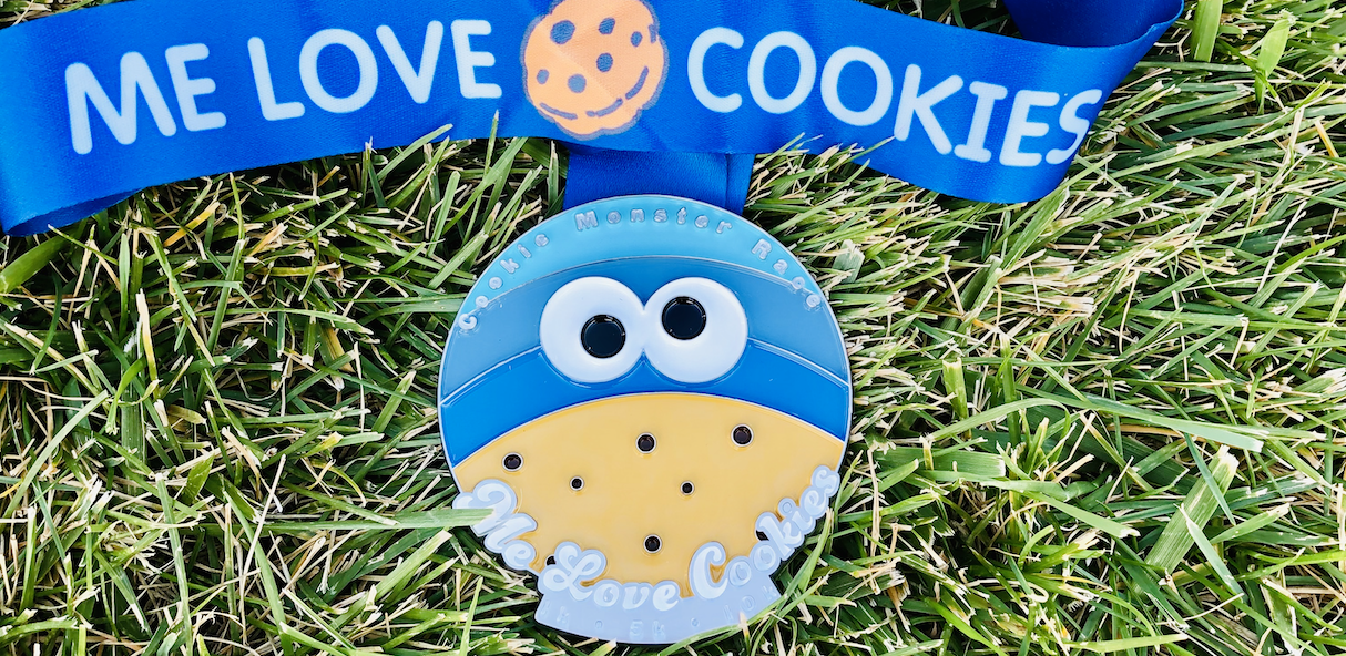
The artwork seen on the on-body render, is the 6 color option, and the detail is a 5 color option.
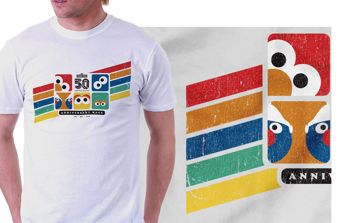
This shirt went through the most creative iterations. A tricky aspect of this design and the SSt logo is when placed on a dark shirt, the logo needs a revered execution. Color was another large determinant, with so many characters each normally tied to their specific color, (Grover and Cookie Monster both a tone of blue) we couldn’t add a lot of color detail.
SECOND ROLL OUT
Coming November - December 2019
